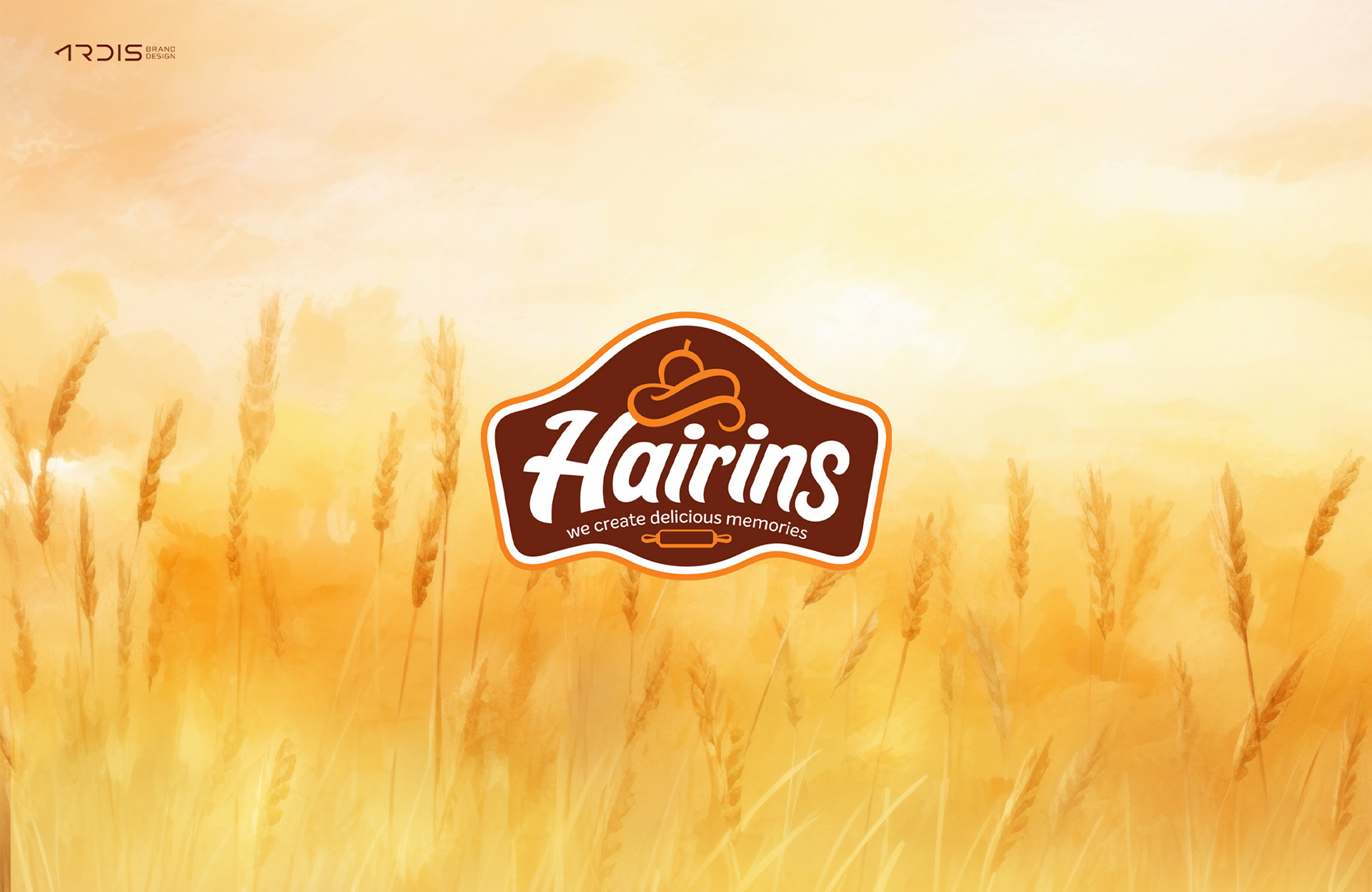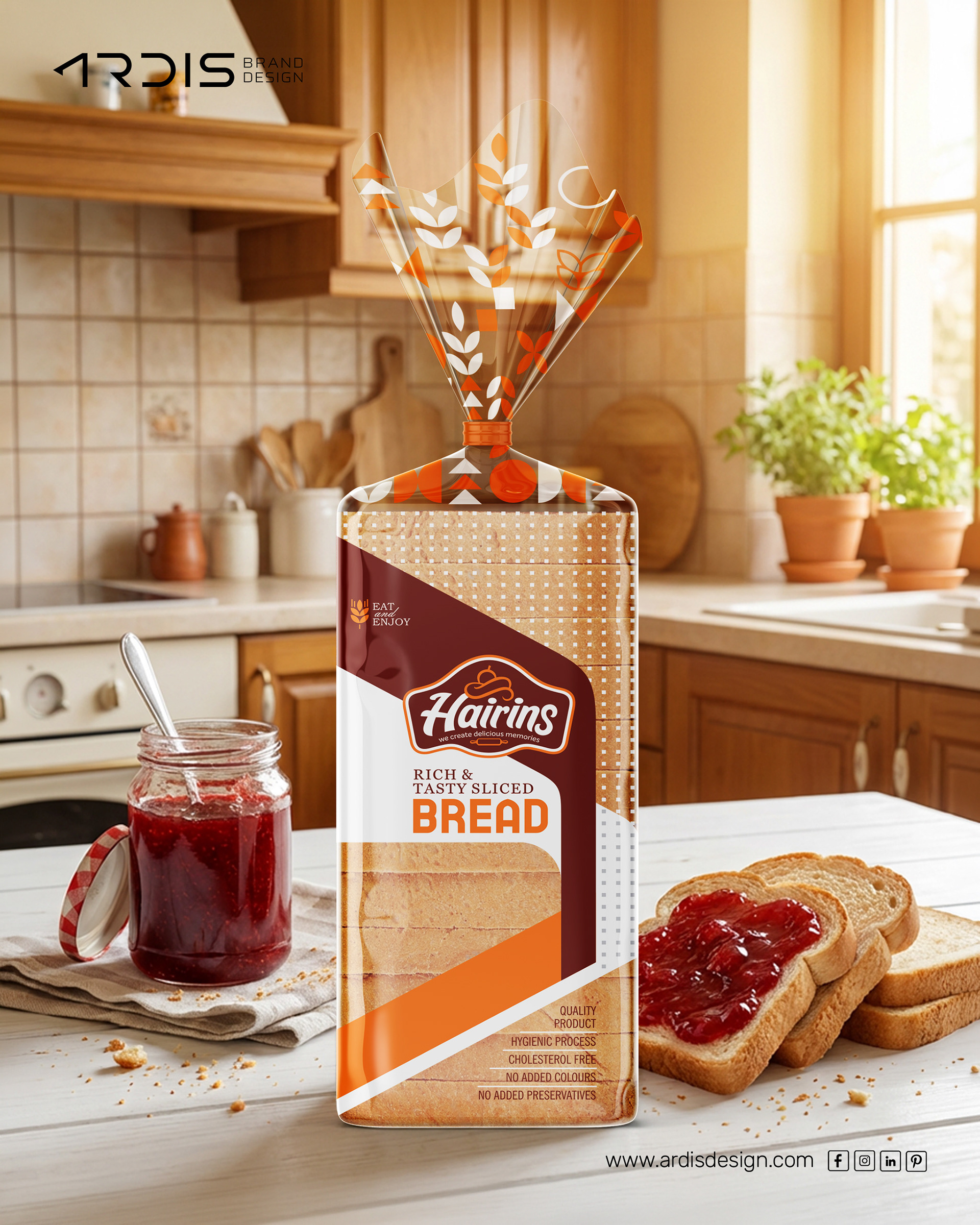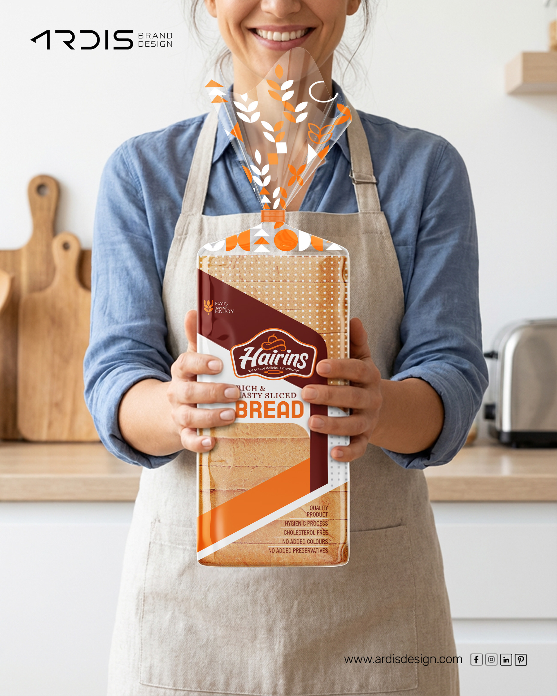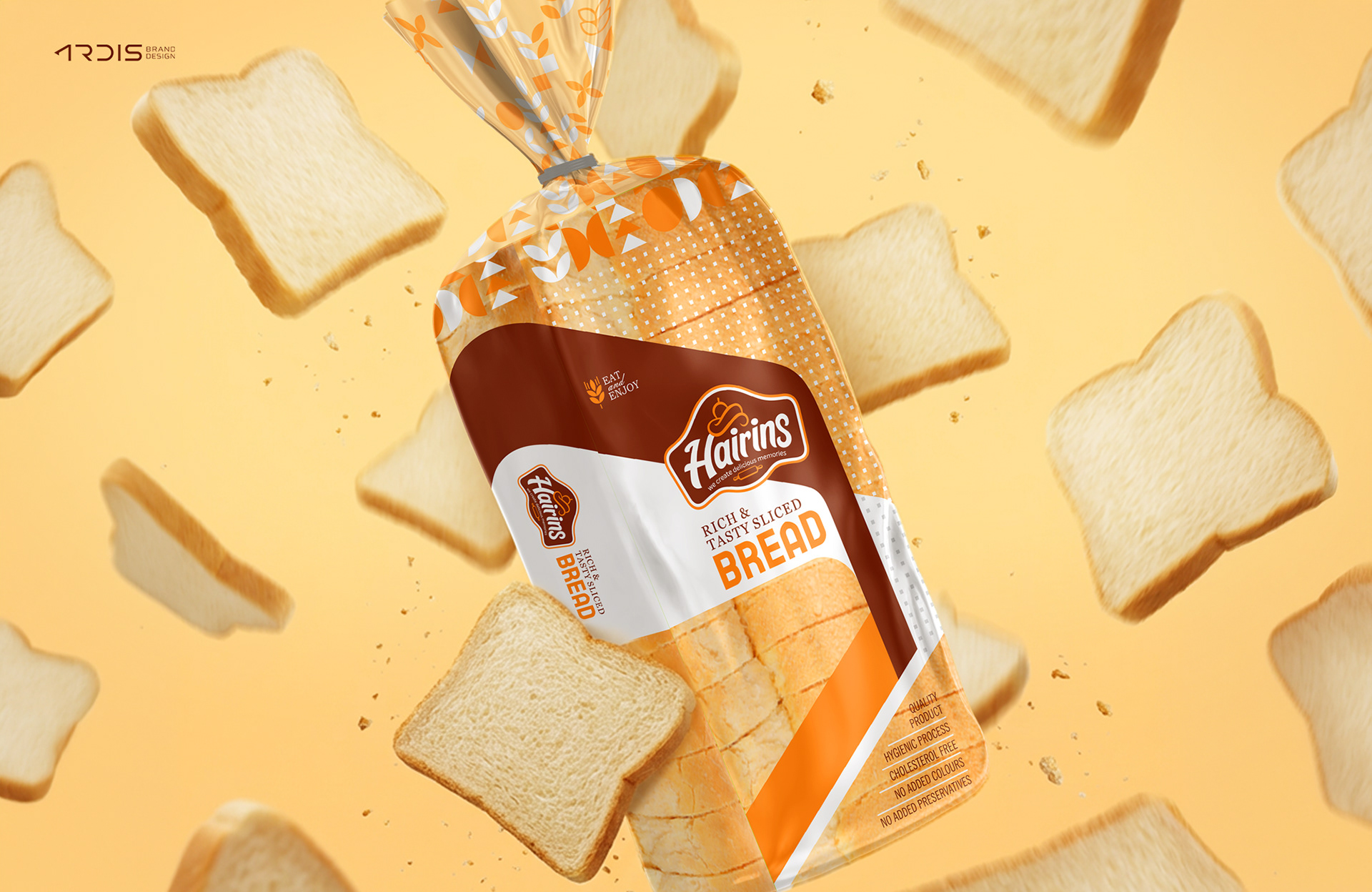
A complete logo and bread packaging design created for Hairins, a bakery brand based in Karuvarkundu, Kerala, India. The objective of this project was to develop a clean and memorable brand identity that communicates freshness, taste, and everyday comfort associated with bakery products.
The visual identity is built around a simple three-color palette – White, Brown, and Orange.
• Brown represents baked goodness, warmth, and the authenticity of freshly baked bread.
• Orange adds energy, appetite appeal, and shelf visibility in the competitive bakery market.
• White ensures clarity, cleanliness, and balance in the overall design.
The logo design incorporates bakery symbolism and friendly typography to create a warm and approachable brand personality. The bread packaging design was carefully structured to highlight the product while maintaining strong shelf impact and brand recognition.
By combining a minimal color system with clear visual hierarchy, the packaging achieves strong brand recall, retail visibility, and a modern bakery identity.